

The Well trades cozy charm for bland beige
“They gentrified The Well!” Lipscomb senior Diane Brown threw her hands in the air. “There’s no character.”
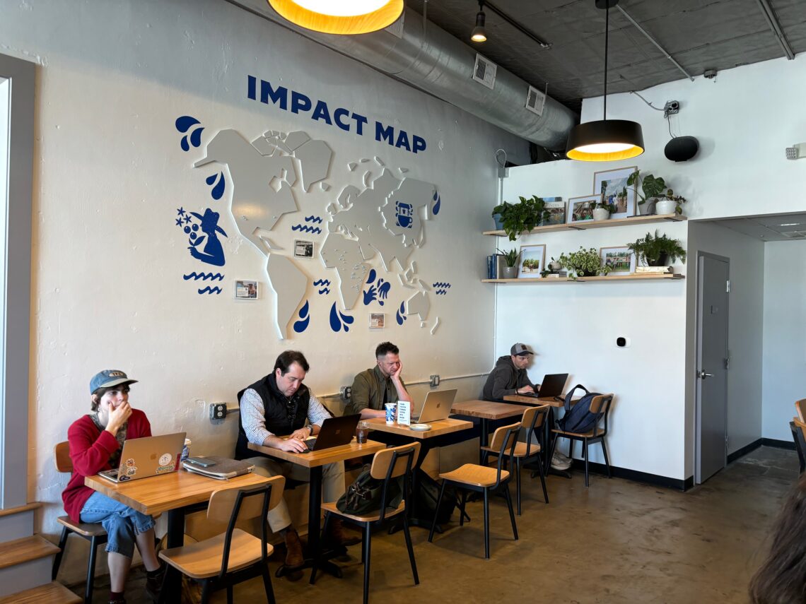
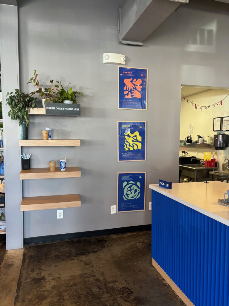
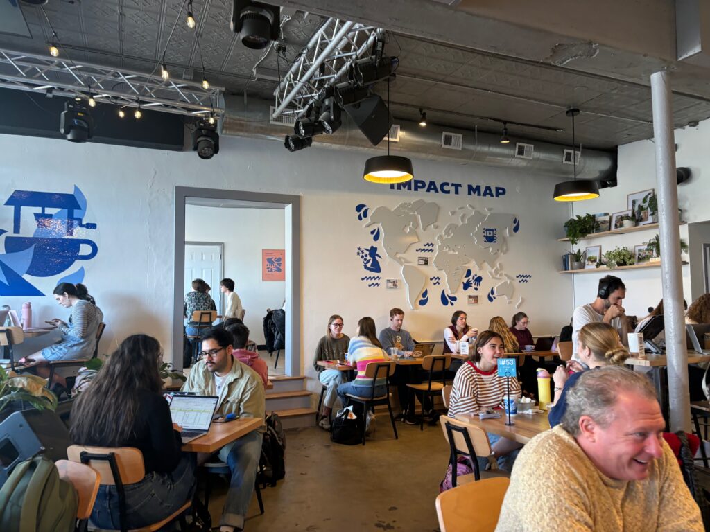
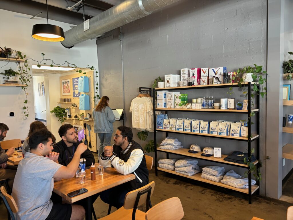
The Well Coffeehouse off of Granny White Pike has recently fallen victim to the boring beige trend. What used to be a cozy, warm coffee shop full of wood-paneled walls and colored photographs showing people around the world that The Well has helped is no more. Now, the walls are blank and boring. The seats are stark, plain wood and the counter has been painted a bright blue.
Perhaps saddest, though, is the large wooden map decorated with orange pins and small photos, showing every location where The Well has dug a well for an under-reached community, is gone. Though a new map has replaced it on another wall, it’s less fun – a more sterile version of the original, in bright white and blue.
If you didn’t already know The Well’s mission, you would never know it now, looking at the decor. Where once was a map showing every location wells have been dug through The Well’s profits, there is a rack of items for sale. The new map that has replaced it is boring and “trendy,” but fails to relay The Well’s mission.
The Well was founded by a Lipscomb alumni, Rob Touchstone, and it donates all of its profits to digging wells in under-reached communities. They have dug wells in countries all around the world, including those in Africa and South America. The Well’s mission statement is “turning coffee into water.” (Click this link to read more about The Well and its founder, in Herd Media Jude Henderson’s article.)
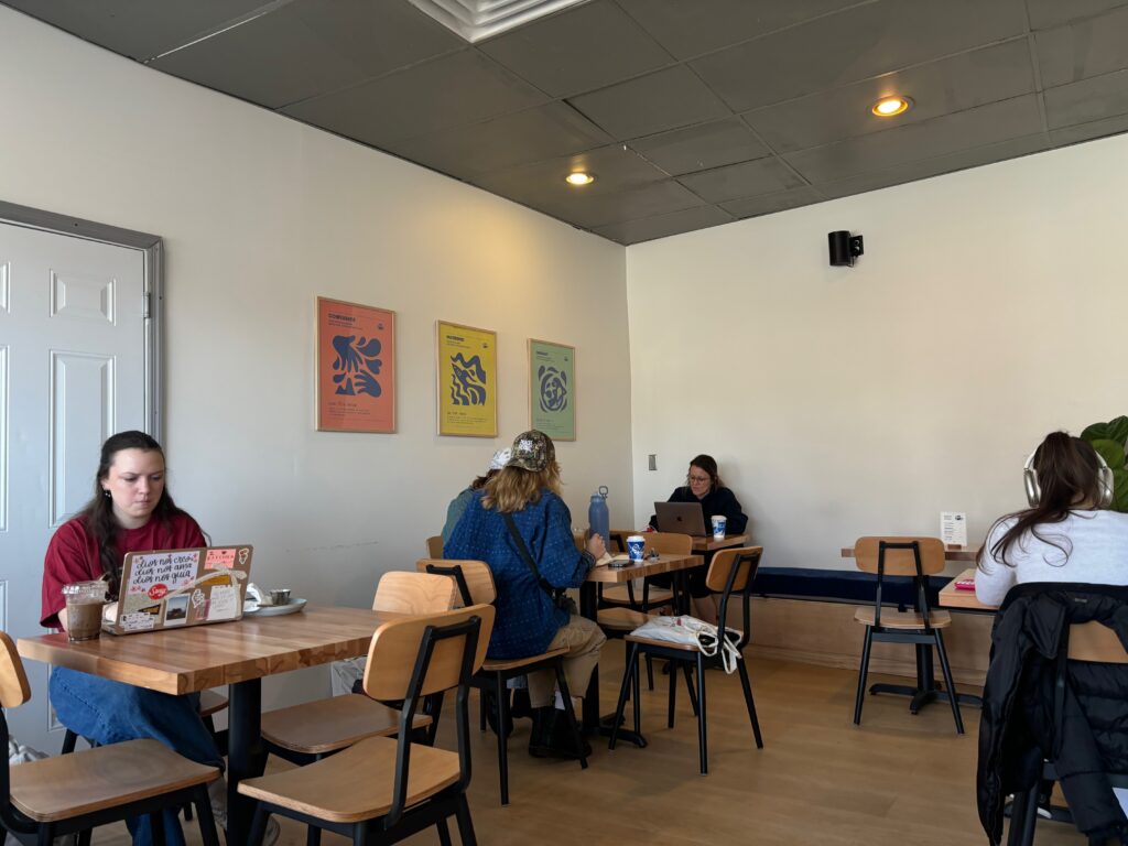
All the photos of happy children and gallons provided that used to surround the order counter have vanished, as have the large prints of children with their hands under water spickets. The few photos that do remain are small, and so overwhelmed by the off-white walls and tan shelves they sit on – not to mention the white matting around each photo – that they are barely noticeable.

Not even the bathrooms were spared in the remodel. Gone are the homey paintings of barns and cabins, the pictures of people helped by The Well’s efforts. Instead, simple blue and white wallpaper tops a chair rail, as bland as the rest of the cafe.
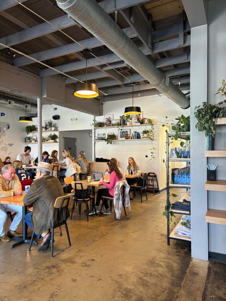
One of The Well’s biggest issues is seating. Yet the new remodel did nothing to grant them any more. Instead, it decreased the available seats. Though this will change whenever The Well expands, but that comes at the loss of the Subway next door.
Brown, in her fourth year at Lipscomb, has been going to The Well since her sophomore year for both coffee and concerts. “I just think it sucks that such a unique and cool space looks like everything else,” she said. I couldn’t agree more.
Many other students have made comments about the remodel, as have several employees, and all are in the same vein – they don’t like it. The term “gentrified” has been used by far more than just Brown, and many have lamented its new “boring” scheme and decor.
Personally, I loved how The Well felt like a European coffee shop – how it was cozy inside, and the darker colors and welcoming, friendly atmosphere encouraged relaxing and staying awhile. Now, The Well’s new stark interior feels like everywhere else; it’s too crisp, too bland, even if it does “match” the ones in the rest of the small chain. The color scheme is so brightly white and beige that it borders on annoying, and this replacing the eclectic wooden walls and warmer color scheme is a sad loss to what was a unique coffee shop.
“Their original layout was really solid,” said Brown. “When you walked in, it was like ‘yeah, this is The Well!”’ Now it looks like every modern space.”
Photos taken by Micah Barkley.